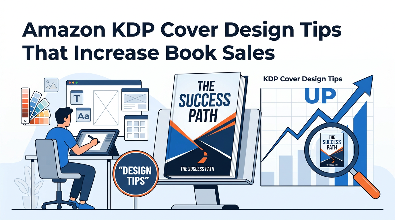
In the competitive landscape of Amazon Kindle Direct Publishing (KDP), your book cover is the single most important marketing asset you possess. It is the first point of contact between your story and a potential reader. In the industry, we often talk about the "three-second rule": you have exactly three seconds to grab a browser's attention, communicate your genre, and signal a level of professional quality that justifies a purchase. If your cover fails this test, your meticulously crafted prose will never be read.
Generating sales on Amazon is a multi-step conversion funnel. It begins with impressions (people seeing your book in search results), moves to clicks (people clicking your thumbnail), and ends with a purchase. Your book cover is almost entirely responsible for the second step: the Click-Through Rate (CTR). High-quality design signals to the Amazon algorithm that your book is relevant and desirable, leading to better organic rankings and lower advertising costs.
This comprehensive guide will move beyond basic aesthetics to explore the technical, psychological, and strategic elements of Amazon KDP cover design. Whether you are a DIY designer or planning to hire a professional, understanding these principles is vital for long-term publishing success.
The Technical Foundation: Dimensions, DPI, and Spine Math
Before you begin the creative process, you must master the technical requirements of the Amazon KDP platform. A beautiful design that fails technical inspection will result in a rejected file or, worse, a printed book with a shifted spine or cut-off text.
1. Resolution and File Format
Amazon requires a minimum resolution of 300 DPI (dots per inch) for all images. While digital screens often display at 72 or 96 DPI, print requires much higher density to avoid "pixelation" or blurriness. For eBooks, your file should ideally be a high-quality JPEG or TIFF. For paperbacks and hardcovers, KDP requires a print-ready PDF.
2. The Difference Between eBook and Print Covers
Many beginners make the mistake of thinking a cover is just a single rectangular image. In reality, you are designing two very different products:
- eBook Covers: These are front-cover only. The aspect ratio is typically 1:1.6. Because there is no physical thickness, you don't need to worry about spines or back covers.
- Print Covers (Paperback/Hardcover): These are "full wrap" designs. This includes the front cover, the spine, and the back cover, all as a single continuous PDF file.
3. Calculating the Spine and Bleed
The width of your spine is determined entirely by your page count and paper type (white vs. cream). If you miscalculate by even a fraction of an inch, your title will wrap around to the front or back of the book, looking amateurish. To ensure your layout is perfect, you should always use a Cover Calculator to generate a template based on your specific manuscript length. This tool accounts for "bleed"—the extra 0.125 inches added to the edges to ensure colors run all the way to the edge after the book is trimmed.
Visual Hierarchy: Guiding the Reader’s Eye
Visual hierarchy is the arrangement of elements in a way that implies importance. On a book cover, you are directing the reader's eye in a specific sequence. If every element—title, author name, subtitle, and image—is the same size, the eye doesn't know where to land, creating "visual noise."
The Primary Focal Point
Your cover needs one dominant element. In many fiction genres, this is a striking image or an evocative character. In non-fiction, the primary focal point is often the title itself. You want the reader to see the main image or the main hook first, followed immediately by the title.
The Thumbnail Test
This is perhaps the most critical tip for KDP success: Design for the thumbnail, not the full-size image. Most readers will discover your book on a smartphone or a tablet while scrolling through search results. If your title is too small to read at 100 pixels wide, or if your imagery becomes a muddy blur, you will lose sales. High contrast and bold typography are the keys to passing the thumbnail test.
The Psychology of Color in Book Marketing
Colors aren't just aesthetic choices; they are emotional triggers. Professional designers use color theory to "prime" the reader for the experience the book provides. If you use the wrong color palette for your genre, you send a confusing signal that results in a bounce.
Common Genre Color Associations
- Thrillers and Horrors: High contrast—blacks, deep reds, and stark whites. These colors trigger feelings of danger, mystery, and urgency.
- Romance: Pastels, pinks, and soft blues suggest tenderness. Darker purples or reds often signal "steamy" or "dark" romance.
- Business and Finance: Deep blues and greens. Blue suggests trust, stability, and authority, while green is naturally associated with growth and money.
- Self-Help: Bright, optimistic colors like yellow or orange, often paired with plenty of "white space" to suggest clarity and peace.
When selecting your palette, look at the "Top 100" bestsellers in your specific sub-category. You don't want to copy them, but you must "fit in" enough that readers recognize your book as belonging to that genre, while standing out enough to be remembered.
Typography: Beyond Selecting a Font
Typography is the "voice" of your cover. Beginners often choose fonts that are "pretty" but illegible. Professional designers look for fonts that convey the book’s personality while maintaining absolute clarity.
Font Pairing Strategies
A common rule of thumb is to use no more than two different font families on a single cover. You might use a decorative, "moody" font for the title and a clean, highly legible Sans-Serif font for the author name and subtitle.
Pro Tip: Avoid "Default" fonts like Times New Roman, Arial, or Comic Sans. These are instantly recognizable as amateur and signal to the reader that the content inside might also be low-quality.
Hierarchy and Placement
Your title should be the largest text element. For non-fiction, the subtitle is equally important because it explains the benefit of the book. Ensure there is enough "breathable" space around the text so it doesn't feel cramped. If your background image is busy, use "drop shadows" or "outer glows" subtly to lift the text off the background and improve readability.
Designing for Different Genres: Meeting Reader Expectations
Every genre has a "visual language." As an author-publisher, your job is to fulfill the reader's expectations while adding a unique twist. If you write a cozy mystery but put a bloody knife on the cover, you will attract the wrong audience, leading to negative reviews from disappointed readers.
Non-Fiction: The Authority Look
Non-fiction readers are looking for solutions to problems. The cover should look authoritative and clean. Use large, bold typography that is easy to read. Many successful non-fiction covers use a solid color background with a single, high-quality object as the focal point. This simplicity conveys "clarity of thought."
Fiction: The Narrative Hook
Fiction covers need to sell a "feeling" or an "atmosphere."
- Fantasy: Often uses intricate borders, magical symbols, and "epic" landscapes.
- Sci-Fi: High-tech textures, metallic finishes, and futuristic fonts.
- Historical Fiction: Often features period-appropriate textures (like parchment or old oil paintings) and fonts that evoke the specific era.
Advanced Strategy: A/B Testing and Data-Driven Design
Don't rely solely on your own intuition or the opinions of friends and family. Your target audience is the only group whose opinion matters. Modern publishers use data-driven design to ensure success.
The Power of A/B Testing
A/B testing involves showing two different cover versions to a sample of your target demographic and asking which they would be more likely to click. Tools like PickFu or even Facebook Ads can be used for this. You might test two different background colors or two different font styles. Often, the version you personally like best is not the one that performs best in the market.
Optimizing for the Amazon Algorithm
Your cover is part of your metadata. While the image itself isn't "read" by the search engine in the traditional sense, the *behavior* it triggers is. If your cover attracts clicks, Amazon’s algorithm notes the high CTR and begins showing your book to more people. To ensure your book is showing up in the right searches so the "right" people see your cover, use a Keyword Combiner to find high-traffic, low-competition phrases for your title and subtitle.
Common Amazon KDP Cover Design Mistakes to Avoid
In our years of analyzing the KDP market, we see the same mistakes repeated by indie authors. Avoiding these will immediately put you in the top 10% of self-published books.
- The "Everything and the Kitchen Sink" Approach: Trying to illustrate every scene of the book on the cover. This leads to a cluttered, confusing mess. Stick to one core concept.
- Low-Resolution Images: Using images found on Google Images. Not only is this a copyright violation, but the images will appear blurry when printed. Always use licensed, high-resolution stock from sites like Adobe Stock or Depositphotos.
- Poor Contrast: Dark text on a dark background or light text on a light background. If you have to squint to read it, it’s a failure.
- Neglecting the Back Cover: Many authors focus 100% on the front and slap plain text on the back. The back cover is where the final "sale" happens. It needs a compelling blurb and a professional layout. When formatting your sales copy for the Amazon sales page, make sure to use an HTML Description Formatter to ensure your description looks as professional as your cover.
- Incorrect Spine Alignment: Nothing screams "amateur" like a title that starts on the spine and bleeds onto the front cover. Use the templates provided by KDP or a calculator.
The Financial Impact: Why Design is an Investment, Not an Expense
Many authors hesitate to spend money on professional design. However, let’s look at the math. A mediocre cover might convert at 0.5%, while a professional, market-optimized cover might convert at 2.0%. This means for the same amount of traffic, the professional cover earns four times more money.
If you are planning to run Amazon Ads, a poor cover will literally cost you money every day. You will pay for clicks that don't turn into sales. Before you decide on your design budget, use a Royalty Calculator to project your earnings based on different sales volumes. You’ll quickly see that a cover that increases your conversion rate pays for itself within the first few months of publishing.
Expert Insights: Trends in Modern Book Design
The world of book design is constantly evolving. Currently, we are seeing a move toward "Illustrative Minimalism" in non-fiction and "Bold Maximalism" in certain fiction genres like Romantasy. Another major trend is the use of 3D depth—adding shadows and layers to make the book look like it's "popping" off the screen.
Another expert tip: Look at your competition’s "Frequently Bought Together" section. If your book is appearing next to high-end, traditionally published books, your cover must match their level of polish. Readers do not distinguish between "Indie" and "Trad" anymore; they only distinguish between "Professional" and "Amateur."
Step-by-Step Workflow for a High-Converting Cover
- Market Research: Browse the Top 100 in your category. Save screenshots of the covers that catch your eye. Identify common themes in color and typography.
- Define the Hook: What is the one thing your book offers? Mystery? Wealth? Love? Choose one image or font style that represents this core promise.
- Technical Setup: Use a template generator to get your exact dimensions, especially for the spine.
- Design the Front: Focus on the "Thumbnail Test." Ensure the title is large and the contrast is high.
- Full Wrap Layout: Extend the design to the spine and back. Ensure the back cover text is legible and has enough margin (don't put text too close to the edges).
- Proofing: Upload your PDF to the KDP Print Previewer. Check every margin, the barcode placement, and the spine centration.
- Launch and Monitor: Once live, monitor your conversion rate. If your "Impressions" are high but "Orders" are low, your cover is likely the culprit and may need a "refresh."
Conclusion: Your Cover is Your Silent Salesman
Success on Amazon KDP is not an accident. it is the result of intentional design and strategic marketing. Your book cover works for you 24/7, sitting on the digital shelf and trying to convince total strangers to give your words a chance. By following the principles of visual hierarchy, respecting genre tropes, and adhering to strict technical standards, you give your book the best possible chance to thrive.
Remember, the goal of a book cover isn't just to be "pretty"—it's to be effective. It must communicate, convince, and convert. Treat your cover design with the same level of respect and craftsmanship that you gave to your writing, and the Amazon marketplace will reward you with the sales and readership your work deserves.
Start today by calculating your spine width, researching your competitors, and sketching out a design that doesn't just look like a book, but looks like a bestseller.
Be the first to leave a comment!